https://plot.ly/python/
文档网址是上面这个。
分2种方式绘制,如果注册了用户名和密码,可以保存到它的服务器上,或者就离线模式,本地查看html
1. 折线图
import plotly.plotly as py
import plotly.graph_objs as go
import plotly.offline as pltoff

trace1 = go.Scatter(
    x=[1, 2, 3, 4, 5,
       6, 7, 8, 9, 10,
       11, 12, 13, 14, 15],
    y=[10, 20, None, 15, 10,
       5, 15, None, 20, 10,
       10, 15, 25, 20, 10],
    name = '<b>No</b> Gaps', # Style name/legend entry with html tags
    connectgaps=True
)
trace2 = go.Scatter(
    x=[1, 2, 3, 4, 5,
       6, 7, 8, 9, 10,
       11, 12, 13, 14, 15],
    y=[5, 15, None, 10, 5,
       0, 10, None, 15, 5,
       5, 10, 20, 15, 5],
    name = 'Gaps',
)

data = [trace1, trace2]

fig = dict(data=data)
plotly.offline.plot(fig, filename='simple-connectgaps')
2.点散图
def scatter_plots(name):
  '''
  绘制散点图
  '''
  dataset = {'x': [0, 1, 2, 3, 4, 5, 6, 7, 8, 9],
             'y': [5, 4, 1, 3, 11, 2, 6, 7, 19, 20],
             'text': ['5_txt', '4_txt', '1_txt', '3_txt', '11_txt', '2_txt', '6_txt', '7_txt', '19_txt', '20_txt']}

  data_g = []

  tr_x = Scatter(
    x=dataset['x'],
    y=dataset['y'],
    text=dataset['text'],
    textposition='top center',
    mode='markers+text',
    name='y'
  )
  data_g.append(tr_x)

  layout = Layout(title="scatter plots", xaxis={'title': 'x'}, yaxis={'title': 'value'})
  fig = Figure(data=data_g, layout=layout)
  pltoff.plot(fig, filename=name)
3. 柱状图
def bar_charts(name):
  '''
  绘制柱状图
  '''
  dataset = {'x': ['Windows', 'Linux', 'Unix', 'MacOS'],
             'y1': [45, 26, 37, 13],
             'y2': [19, 27, 33, 21]}
  data_g = []
  tr_y1 = Bar(
    x=dataset['x'],
    y=dataset['y1'],
    name='v1'
  )
  data_g.append(tr_y1)

  tr_y2 = Bar(
    x=dataset['x'],
    y=dataset['y2'],
    name='v2'
  )
  data_g.append(tr_y2)
  layout = Layout(title="bar charts", xaxis={'title': 'x'}, yaxis={'title': 'value'})
  fig = Figure(data=data_g, layout=layout)
  pltoff.plot(fig, filename=name)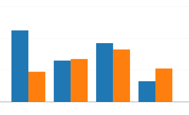
4.饼图
def pie_charts(name):
  '''
  绘制饼图
  '''
  dataset = {'labels':['Windows', 'Linux', 'Unix', 'MacOS', 'Android', 'iOS'],
        'values':[280, 25, 10, 100, 250, 270]}
  data_g = []
  tr_p = Pie(
    labels = dataset['labels'],
    values = dataset['values']
  )
  data_g.append(tr_p)
  layout = Layout(title="pie charts")
  fig = Figure(data=data_g, layout=layout)
  pltoff.plot(fig, filename=name)
3658